You know what’s cool? Two billion pieces of data.
That’s what foursquare is using to fuel its new recommendation engine-ish redesign, released for iOS and Android this morning (Blackberry users will have to wait until next week).
As a self-professed ‘Queen of Apps’ I tend to be critical of app design and functionality, with an emphasis on the user experience. Foursquare’s redesign is clean, elegant, intuitive and packed with useful information.
I’ll admit I’m a foursquare fangirl. I’ve been a user since January 2010 and have racked up 1,629 check-ins and 64 badges along the way. So you would expect me to gush over the new redesign. BUT, believe me when I tell you, this is really something special. Here’s why:
The app has been divided into three basic areas, Friends, Explore and You. It’s simple to switch between each of these areas as the buttons stay at the bottom of the screen as you move about the app.
Friends
Foursquare has transformed itself from a location-based check-in service to a full-blown social 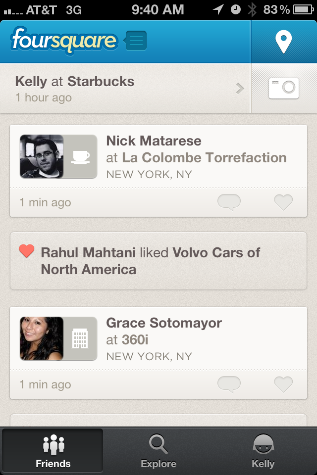 recommendation engine. No longer is the check-in the main focus of the app. The button has been relegated to the top right-hand corner, almost like checking in is an afterthought. What draws your attention when you open the app is the stream of what your friends are doing, in timeline-like fashion. I now can see not only where my friends are checking in, but their check-in photos and comments appear without having to drill down into the check-in itself.
What else will you see on the Friends screen?
- When your friends become Mayor
- When friends follow a page or become friends with someone
- When your friends like a page
- When a friend unlocks a badge
Explore
Clicking on Explore brings you to a completely new screen that displays a map of your location, pictures 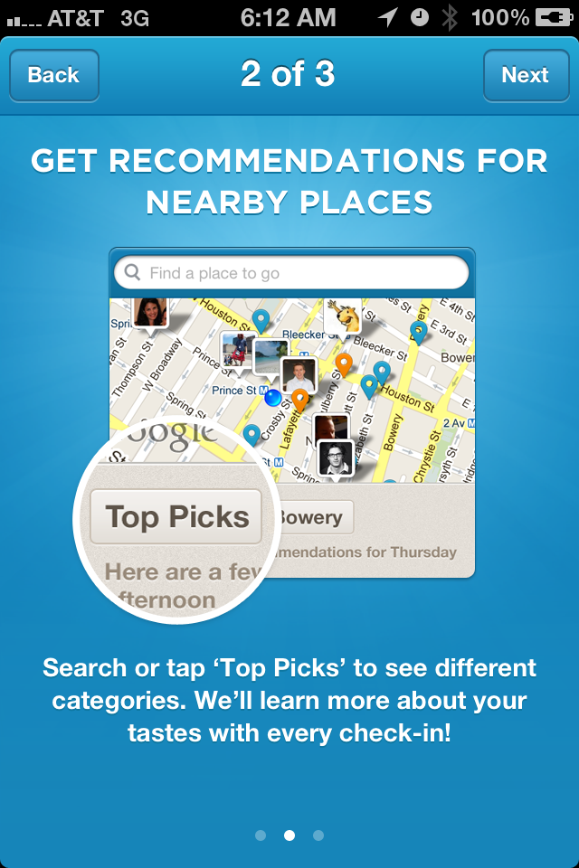 of any of your friends who are checked in nearby and little map darts (non-technical term) that show you places to go and tell you why you might want to go there.
Below that you will see ‘Top Picks’ near ‘Location.’ Both of these words are clearly clickable, as they are big buttons. If you’re not interested in Top Picks, you can choose Specials, Sights, Food, Coffee, Nightlife, Shopping, Arts and Trending. What more could you ask for?
Scrolling through my Top Picks I was offered ‘Suggestions for Thursday morning’ which included Starbucks and Dunkin Donuts (both places I have checked-in), nearby specials, ‘A Spot for Drinks Later On’, ‘Want to Grab a Bite’ and my favorite ‘Buy yourself something nice?’
Beyond each suggestion are additional suggestions based on your check-ins and the check-ins of your friends.
You (or me)
On this screen you will find everything about you on Foursquare: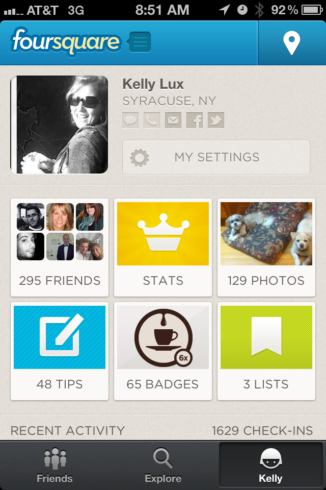
- Who your friends are and how many you have
- The leaderboard and your mayorships
- All your photos
- The tips you’ve left
- How many badges you have, divided into categories: foursquare specific, expertise, partner, and all badges
- Lists: created and saved
I love how this is all compacted into neat little windows on one screen, but you can still drill into any of the areas you’re interested in. Looking at my badges, I was able to tell when I joined foursquare because it told me the date I unlocked the ‘newbie’ badge. The only thing I didn’t see that I would like to is who has completed each of my tips, or at least how many people have done so.
Saving the best for last…
When I’ve used foursquare recently, I’ve found myself wishing for a ‘like’ button that I could use to acknowledge my friends’ check-ins if I didn’t have a comment. A little more than a week ago, I decided I would tweet my wishes, and decided to mention @dens in the tweet, just in case he was paying attention. Here’s what I got in return:
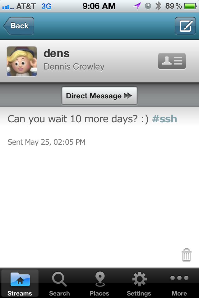
My wish was coming true! And turns out it’s not a dumb-looking thumbs up, but a heart…reminiscent of my other favorite app: Instagram.
What I find most amazing about this is NOT that @dens (founder of foursquare and iSchool alum) responded to me. What’s most amazing is how aware of and responsive to the needs of their users foursquare is. Obviously they didn’t build a like button because I tweeted about it. They know their users well enough to understand what they want out of the app.
It has been reported and discussed on twitter of late how users have become bored with just checking in. The thrill of unlocking a badge has somewhat diminished over time and I don’t even care how many points I’m racking up on a weekly basis. What I DO care about, and what foursquare is responding to, is the consumer demand for information on where their friends are in real-time and what they are doing. Foursquare has answered this beautifully with their redesign. As mobile becomes more dominant in our lives every day, this kind of information becomes even more valuable. Foursquare is now not only the king of location, but they are poised to become the dominant player in social recommendations. Bravo, team foursquare!
Are you a foursquare user? What do you think of the redesign? If you’re not, do the updates tempt you to join?