When we think of maps, many of us either think of Google maps with its street view features, our car’s GPS, or, if we are a library student, the pristinely preserved documents from bygone eras found in archives. But there is so much more to maps! Digital maps provide amazing opportunities for integrating and displaying large sets of data and research in innovative and interactive ways and the world’s taking notice!
History:
 The GIS technology and interactive maps I am discussing were made possible by the creation of the Topologically Integrated Geographic Encoding and Referencing (TIGER) system in the 1980s. The U.S. Census Bureau developed a comprehensive digital database of geographic data in order to support the organization of Decennial Census and other Bureau programs. Think about it! Without highly accurate maps containing street information for a city or state or where a mountain is, it is impossible to assign or evaluate the census data the bureau collected in an area. What followed was revolutionary. The development of advanced GIS technology based on the TIGER framework allowed for the integration of any kind of data into complex maps to meet a wide variety of industry needs. Now users can be inserted into the map and the data displayed dependent on their information needs. That’s why the Google maps app can display all the sushi restaurants close to your location when you’re going out for your lunch break. Penn State released a very brief and informative documentary series available for view on YouTube on the geospatial revolution.
Today:
GIS technology allows information, especially large sets of data, to be visualized on maps. Visualizing information allows people to connect the dots in ways stagnant text paragraphs or data tables alone cannot achieve. Not only is that, but being able to toggle a map to discover information about a location is far more engaging. This provides scientists, scholars, educators, heck just about every industry to showcase information in innovative ways. After all, a picture is worth a thousand words.
While there are many ways organizations are taking advantage of maps to showcase and explain large amounts of data, improve business or make more effective a conclusions more effective, here are two I found especially neat to illustrate my point.
NASA’s Science Visualization wall displays scientific data in interactive maps and is leading to new discoveries on how the planet works. These maps can interpret and display data to show what weather will look like on the planet’s surface in advance climate models. You can see really great images of this at Dan Satterfield’s blog. NASA also released the NASA Visualization Explorer app which displays data about Earth, sun, moon, planets etc. on interactive maps delivered right to your iPad. It’s really cool and free!
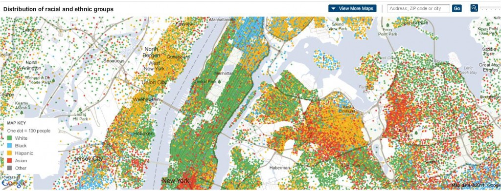
Image from pecology.com
New York Times Map America: Several newspapers are taking advantage of interactive maps to educate their readers on large sets of data that is difficult to explain (and boring to read). The New York Times project to Map America, utilized census data to show the racial make-up of the country by neighborhood. It’s quite fascinating. You can toggle the map to discover how diverse your neighborhood is.
On a side note, The Journal News made headlines when it created an interactive map showing all registered gun owners in the New York area. Stating there are too many guns is one thing, but to show the density and information of individual gun owners on a map is far more visually impactful. Unfortunately the controversial map was removed.
To see more examples, flowingdata.com dedicated an entire blog to cool map visualizations of data.
Great Opportunity for Libraries:
These advancements in maps and GIS provides opportunities for digital libraries to showcase collections and resources in new and innovative ways. The addition of a geo-location service, such as an interactive map, can significantly enhance the content of a digital library’s collections. Not only that, but for most libraries, users are limited to text base searches for information or browsing by subject. How boring! Maps are far more engaging as a user can click on the map to see what items in that area the library can offer. Think of the possibilities for learning about local history.

Image from the Wikimedia Commons.
There are pioneering Digital Libraries already doing this. The World Digital Library is a collaborative project between Library of Congress, UNESCO and library partners across the world. The library hosts an interactive map where users can select either a region or time period, and view all the resources in the digital portal associated with that selection. Additionally, Brigham Young University developed an application called mappifY that pinpoints and displays a variety of items from the University’s collections on an interactive Google map.
I can’t wait to see what new opportunities to showcase information that maps and technology will create going into the future!
What do you think? Have a cool map visualization or map project, please share in the comments below.